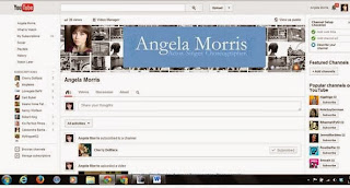
Actors, much as we may resist thinking of ourselves this way, are a product in a self-owned small business. I want my product to have a specific look that can be easily identified. I'm trying to brand myself across different media. The way that I'm accomplishing this goal is pretty basic; consistency in colors and images.
My biggest tie in across mediums is the color scheme. I chose blues and whites. I chose blue because it makes my eyes pop. Seriously, that's the reason I chose that scheme.
I also have my profile picture consistent across most mediums. Further, I designed my logo and used it on both my website and my youtube channel. I deliberately didn't use the logo on this blog because I didn't think it was appropriate. Self-promotion is an added plus of having this blog. However, its content is not centered on me. It's about the business, process, etc. of acting and the city of Chicago.
Here are some screen captures of various online presences:
 |
| Website Screen-capture |
 |
| Blog Screen Capture |
 |
| Youtube Screen-capture |
A note on my twitter:
If you've visited my Twitter you'll notice that the only thing that it has in common with the other mediums is my profile picture. Other than that, it's a crazy colorful comic book type tiled background. I love it. It's quirky, it's eye catching, and it's me. Is it bad that it isn't consistent with the other mediums? I don't know. Does my concern for cohesiveness outweigh how much I like its look? No.
I'd love to hear your thoughts on consistency across mediums. Does it matter? Am I completely full of it? Etc.


